Sketching the note taker
May 12, 2014
Hacker School has invited alumni (like me!) back for a “reunion week” — a brief reprise of the fun and learning that was Hacker School.
An overarching goal for this week is to get quicker at bringing web apps from idea to prototype. I’d like to consistently go from zero to working code that demonstrates my idea in 1-3 days — not weeks.
So my current project is a note taker app. Note Taker (I’ll come up with a cool name later) lets you quickly record unorganized info, sync it across devices and browse it by date or contents.
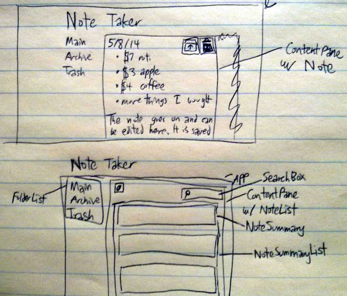
Here’s a crappy photo of my UI sketch:

I plan to use React for the UI. The Thinking in React blog post recommends starting by drawing boxes around each component and giving each box a name, so that’s just what I’ve done. The App component holds all interactive bits on the page, and its children fall into this hierarchy:
- FolderList: shows “Main”, “Archive”, “Trash”, bolding the folder you’re currently listing notes in (if any)
- ContentPane: holds either a FilterableNoteList, if listing
notes in a folder, or a Note if viewing/editing a single note
- Note: lets you edit a note, or archive/trash it
- Text box to view and edit note
- Archive and Trash buttons
- FilterableNoteList: lists notes in a folder
- Button to create a new note
- SearchBox: lets you type search terms to filter notes
- NoteSummaryList: lists notes in folder which match search
term
- NoteSummary: shows a possibly abbreviated view of a note, which can be clicked to bring up a full, editable view
- Note: lets you edit a note, or archive/trash it
For the layout, I’m trying out Pure CSS, a small CSS lib from the YUI folks at Yahoo! that promises to be less opinionated and easier to build on than, say, Bootstrap. Pure CSS seems handy so far, and its grids are easy to get started with. Screenshots to come, soon!
